 |
Dan Bricklin's Web Site: www.bricklin.com
|
|
Responsive Web App Design
Examining the need for responsive design centered on mobile business web apps written in HTML5 and their layout, including a video
|
A major challenge for developers of applications is to create something that works on multiple devices. This had led to the current movement to write applications, especially business ones that are not customer-facing, in HTML5 rather than native code. HTML5, running in a standards-compliant browser or native web view, is closer to "write once, run anywhere" than most native code, like Android Java, Microsoft C#, or Apple Objective-C. I have written a lot about this (see An Overview of HTML 5, PhoneGap, and Mobile Apps, How HTML wins, Are mobile apps really slow?, and More about web app speed). These HTML5-based apps, called "web apps", are becoming more important as mobile browsers, in iOS and Android as well as FireFox OS, Windows, Chrome OS, are bringing more access to more device capabilities through JavaScript.
An issue with any app, HTML5 or native, is dealing with the different screen size variations. There are portrait and landscape orientations, 4- and 5-inch phone screens, 7-inch and 10-inch tablet screens, 11- to 27-inch personal computer screens, and 40+ inch flat panel displays in conference rooms and homes. The 10-inch screen of a touch-controlled tablet held in the hand needs buttons at least 1/2 inch or so in size to be reliably operated, while a mouse- or touchpad-controlled 11-inch laptop sitting on a desk can get by with much smaller targets to click.
For any complex application, one layout of data and controls will probably not suffice for all of these variations. Scrolling and zooming is often not a viable option -- you want to provide context, and you want to appropriately juxtapose the right data being displayed with the right controls.
Responsive Web Design
In web site design, there is a new popular term: Responsive Web Design (RWD). This term, coined in an article in A List Apart by Ethan Marcotte in May 2010, refers to, according to Wikipedia, "...a web design approach aimed at crafting sites to provide an optimal viewing experience -- easy reading and navigation with a minimum of resizing, panning, and scrolling -- across a wide range of devices (from mobile phones to desktop computer monitors)". The "poster child" for implementing this type of design for a web site has been The Boston Globe's www.bostonglobe.com site. In fact, three years later, we still hear that site used as the example. Much of what is "responsive" are changes to the positioning and size of various columns and boxes as the browser width changes. In fact, most definitions of "responsive design" are focused on the set of technologies initially used to implement it, such as CSS media queries, rather than just the overall goal of an "optimal viewing experience".
In many of these cases, it seems that the RWD design started out as a full-fledged web site for access with a desktop browser on a large screen, and then was "cut down" in ways that made it fit better on the smaller screens without lots of zooming in and out yet retaining access to all of the original content with a pleasing layout based on an organizing grid.
On the flip side of Responsive Design working this way, there has been a call for "Mobile First" that advocates starting from the mobile view. In that case, the desktop version could end up stripped down, missing features like use of location data and not taking advantage of the large, mouse-navigated screen.
Sometimes you will see sites that act more like the "mobile versions" of old, and are almost "WAP-like" at heart: Detection of smartphones and an interface that consists of a scrolling list of links and perhaps a drop-down menu accessed through a button at the top -- a severe change that is especially bothersome when inappropriately forced on a tablet of the same operating system. This is sometimes referred to a "mobilized web sites". ("WAP" is an early mobile wireless display standard used by phones before there was full browser support of HTML, CSS, and JavaScript.)
Web Apps
Much of what is written about RWD is about "web site viewing", that is, what are usually called web sites. However, there is another use of web technologies: HTML5 web apps used for something more like regular native-code apps than sites like The Boston Globe or Disney.com. These are apps that let you do something other than just reading content created by others, such as entering or updating multiple forms of data, doing complex queries, or controlling remote devices.
For web apps you expect even more extensive user interface capabilities than on a web site meant for reading. On a tablet, for example, you would expect, as appropriate, a mixture of scrolling lists, toolbars, choosers, keypads, and other UI widgets as well as popups, dropdowns, and slide-in tool trays to hold them. You expect to be able to swipe through lists of data and tools. When you rotate a device from portrait to landscape you would expect the layout to change, perhaps moving a toolbar or list from the top or bottom to the side, and perhaps changing the direction you need to swipe or scroll. When the same app runs on the smaller screen of a smartphone, you might expect some of the areas to move off-screen with handles or buttons to bring them into view, and the contents of listings to be terser, with details possibly being available by tapping on a row. The types of UI widgets might change, for example using a longer, more verbose list rather than a simpler spinner. On a laptop or desktop, you would expect use of the keyboard and mouse for data entry and control, with "tooltips" when you hover over tiny controls, and key-press input instead of on-screen tapping. In dashboard apps or ones used for repeated input, complete control over the layout of what exactly fits on one screen is important.
These changes from one device or orientation to another are really no different than you would expect from good hand-crafted native apps on the same platform and in the same orientation. In fact, when I built my Note Taker HD iPad app in native code, I implemented my own layout engine to handle the many permutations that depended upon the device orientation, editing state, right-handed vs. left-handed, etc. And, I needed to do that even though there were just two device variations (the orientation). (In "left-handed" operation, for those who write with their wrist above their fingers, I needed to reposition the writing area to the top of the screen and the toolbar to the bottom instead of their default positions. That needed to work in both orientations, too.)
I would still call this more extensive form of layout changes "responsive design" (if not capitalized "Responsive Design"), even though that would expand the definition from "optimal viewing experience" to "optimal user experience". To avoid confusion with an existing term, though, perhaps "Responsive Web App Design" or "Responsive App Layout" (to emphasize the two-dimensional nature) is better. The same careful user experience thinking and crafting that you would use for a single-target native app needs to go into each of the different variations of a responsive web app. For example, in a business app for data acquisition used on an easily held 7-inch tablet while standing and paying attention to a customer or factory process, you might expect to need larger button areas for reliable touch operation than on a similar 10-inch tablet used more comfortably while sitting down.
Examples of responsive apps
We have The Boston Globe as an example for "viewing" responsive design. Which examples should we point to for web app responsive design? Which patterns should we examine?
One place to look is at native applications. The iOS devices support orientation changes and come in a variety of sizes. Many apps are specific to iPhone or iPad, but others are designed to work on both devices full-screen (iPhone-specific apps can run partial-screen in the iPad, and iPad-specific apps do not work on the iPhone). Apps have the option of taking advantage of the extra length of an iPhone 5. Android apps have the option of conforming to the wide range of physical configurations, though most are designed for phone use.
While support for different orientations was in some devices before the iPhone, for many people the iPhone was their first experience with it. Two of the built-in apps, the Calculator and Stocks apps, showed examples of being responsive in ways other than just "expand or shrink to fit width and height". The Calculator app shows extra, "scientific" keys (like square root and log) in landscape mode. The Stocks app shows the price history chart full-screen in landscape instead of sharing the screen with a list of stocks and their current prices, and swiping sideward switches between stocks instead of between the chart, news, and financial summary of the selected stock. The Mail app on the iPad switches between a popup list of emails and a fixed list as you go from portrait to landscape orientation. The user-purchased Pages word processing app from Apple for the iPad has a ruler and toolbar with formatting buttons, while the iPhone version requires using a menu item to view the ruler and a button tap to bring up a formatting dialog. The Android Calendar app on tablets uses a different layout for landscape and portrait orientations in Week view.
As of this writing, while some might use the browser-accessed Google Docs and maps as examples of the power of web apps just as they have in the past, those particular web apps don't seem to do this responsiveness based on screen real estate -- Google depends on native code apps for much of their mobile "app" offerings, and even they don't do much that is responsive to orientation.
With the increasing capabilities of today's browsers with access to the underlying hardware, and the need to take advantage of HTML5 for deployment, we will see more and more HTML5 apps that need to be responsive to their environment and I know that others without Google's financial wherewithal and experienced staff will choose the HTML5 route.
A digression: What led me to look at this
Let me explain how I ran into this issue. While this saga starts out very specific to the web app I was building and to the tool I was using to build it, the actual results, from the user viewpoint, have little to do with that app or that development system and could be applied to most any other app and most general-purpose, professional-level development systems. However, by seeing what I did, you'll see the issues that you might want to think of addressing and what I mean by responsive web app design. You'll also see an example of such an app and development system capabilities that supports constructing it.
I was working on a web app as a sample for using the Alpha Anywhere development environment. (I am the CTO of Alpha Software Corporation, and their product, Alpha Anywhere, is used to create HTML5-based business applications, both for mobile as well as desktop browser clients, along with the server-side code that connects to databases, etc.) The app I was working on was for entering and processing expense reports. This is a logical type of example for Alpha Anywhere: Data capture on mobile or laptop devices, management approval perhaps on a desktop with a large monitor to see lists and details with the speed of using a keyboard and mouse, and reports for accounting and HR, with the process flow happening through use of a corporate database. This is also similar to many apps needed in business: CRUD (Create, Read, Update, and Delete) database operations, with forms, tools, input and output widgets, as well as with much custom design of what is easy to get to and what is harder but still available.
I started building the app for a smartphone. There are many expense reporting native apps, and, like them, I started with some lists for the different trips and the expenses in each trip. I worked on the screen for displaying the details about each expense, its category, description, amount, date, etc. For entering the information, the smartphone keyboard was often inappropriate: A keypad tailored to money, positioned appropriately, worked for the expense amount, while a calendar or set of spin wheels seems best for the date. The category would best come from a list, perhaps one that could be extended. Descriptions may be typed in or come from boilerplate or previous entries.
Just for data entry, I ended up with an app with either a long scrolling form, or, better, a list of values with entry panels that slide in when tapped. The scrolling list needed to be in a different layout in landscape and portrait, perhaps with the keyboard below in portrait and on the right in landscape.
Here are some early mock-ups my designer came up with:
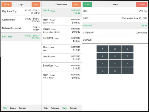
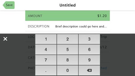   This was all nice and good for the smartphone, but when I built a prototype and ran the same thing on a tablet, I saw that the layout was completely inappropriate, with lots of distracting and useless whitespace. A full-size tablet had enough room to include the list of expenses, the details, and one or more of the entry controls. Again, portrait vs. landscape brought up the need for major layout changes.
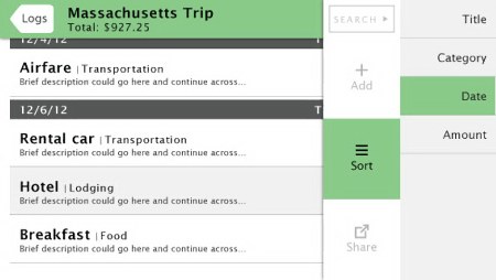
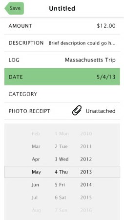
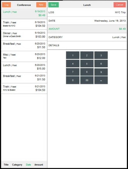
Here is a later design made for a tablet:
 I was starting out as a traditional iOS developer (along with a UX designer who had also worked in the native mobile space with me previously). We had already created a popular app in a very competitive category. As we built this new mobile web app, we brought the same thinking to our implementation. We had many useful controls and containers provided by the development system that could be used to implement each of those variations. All I had to do was actually do the implementation.
At this point, I was ready to code it the same way that I coded iOS apps: When a screen is displayed, or the orientation changes, I would have manually written code (in this case JavaScript) that carefully positioned everything. I'd have to manually code the settings for the slide-in panels, and the scroll directions.
This was a problem. Tedious coding like this is counter to the way you usually do things in Alpha Anywhere. Normally, you just specify controls and their relative positions in an easy-to-use tree and property sheet interface with little coding. Now I had to calculate and set and reset positions explicitly through many lines of JavaScript programming -- lots of tedious coding in a system that tries to minimize the need for coding except for unusual cases. Alternatively, I could create each of the different variations in their entirety using the simpler property sheet interface, and hide and show the appropriate ones, mirroring the data in each. That didn't seem right, either. There would be the need to maintain multiple copies of the same thing which is error prone and still tedious.
I realized that the detailed, tedious nature of this type of coding would be a barrier to other Alpha Anywhere developers. Often working on apps for internal corporate use, with tight schedules and budgets, those developers would be trying to produce their apps as quickly as possible and would be more concerned with getting the right data organization and level of security than making the best variations for many different devices and orientations. We had to make it easier to create layouts that were adjusted automatically based on screen size, orientation, etc., and to make having the variations a natural part of building an app.
This problem isn't just restricted to Alpha Anywhere. Much of the web apps that are created today are hand-coded in JavaScript, using various libraries such as JQuery Mobile and Sencha Touch. The tedious nature of providing lots of variations, and applying them dynamically, is probably responsible for some of the lack of examples of responsive web apps. If you are doing so much specialized coding, and have the time to do the careful crafting, perhaps you'd be better off doing native code anyway.
Practicing informational web site responsive design with traditional tools is much easier: In many cases, the entire control of layout is specified in the CSS which you use from someone else's template. An awful lot of WordPress web sites can all behave in a similar fashion to changes in screen size -- the differences between sites are more in the specific images and text that appear, not in the general layout. This is unlike apps, where there may be a need for much more custom layout variation and which have interactive components and where scrolling is less of an appropriate option to deal with elements that don't fit on the screen.
So, implementing responsive web app design is hard. However, I don't think that that's an excuse for not doing it. The usability benefits and user satisfaction benefits are worthwhile in terms of operator productivity and error-rate reduction. As users get used to apps that "fit right" they will find those that don't fit uncomfortable.
A step to make it easier
There are advantages to working for a company that builds the tools with which you develop. I got to address this authoring issue with the people who develop the tool I was using. Alpha Anywhere is a relatively new product (released just a few months ago) with pretty complete but basic mobile support to go with its extensive desktop, database, and reporting capabilities. We were, though, continuing to add capabilities as we always planned. Now was the time, we decided, to tackle more extensive auto-layout, more than the basic "hide a list if it doesn't fit and replace it with a button" and "size control to fit" capabilities that were already working pretty well. Luckily, we were starting from a strong base: Alpha Anywhere has a very powerful set of containers and controls, including panels that can slide in and out or pop up in various ways, and a list control that has very precise control of the display in HTML and many options. The JavaScript framework that Alpha Anywhere uses to implement the UI is pretty powerful and controllable, and we, at Alpha, can make changes as needed to support new features.
What we now have in Alpha Anywhere, in the "pre-release" builds available to subscribers, is the start of that auto-layout.
The first new part is a list of rules you can specify (or choose from a pre-specified list) for the conditions you want to test for, such as screen size and orientation, input state or user access-level, etc. For each rule, you can assign actions. The actions are generally the setting of attributes of the various user interface controls. This includes their size, position, scroll-direction, slide-in-out parameters, etc. An action can also change the template used to render items in a list.
Here is a screenshot of the new "Responsive Layout Genie" dialog:
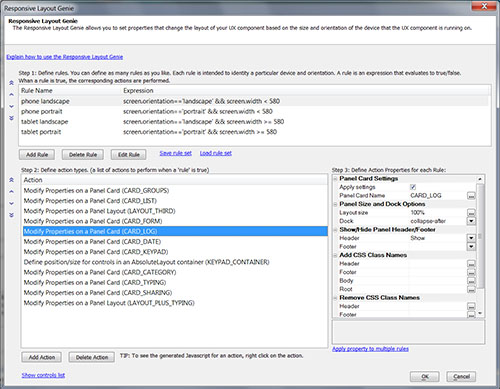 The other new part is an "absolute position container" that lets you position controls absolutely with drag and drop instead of the normal relative positioning and tree control.
Rules can chose different absolute positioning for the same controls within the container.
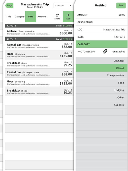
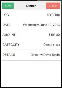
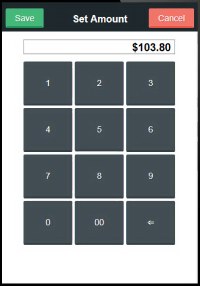
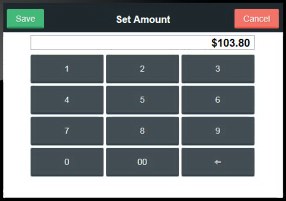
Taking this, and a more refined design from my designer more tuned to common iOS usage, I built a responsive app. Here are some screenshots of part of that simple app, implemented in HTML5 using Alpha Anywhere, that show different layouts in different situations:
     Presenting this material in a 10 minute video
I've created a video, Responsively Laying Out Web Apps, that covers all of this and shows the app in operation, as well as the Alpha Anywhere Responsive Layout Genie:
Video on YouTube
What have I learned from this?
I've learned that having functionality built into your development system that looks to responsive design is a help. Having a "state table" type of declarative interface for specifying the variations, in addition to being able to control things programmatically if you want, is a good thing and aids in looking at many cases in unison.
I also see that it would be good to have lots of "best practice" design patterns for business applications to look to for inspiration, especially with regards to layout, types of controls, and dealing with different devices. When should you juxtapose data and controls and when do you slide in tool palettes? When do you use relative positioning based on screen size and when should you explicitly set size and position of elements? What types of animations should be used and when? When is a spinner better than a list? Buttons vs. keypads? What example apps should we look at?
As more and more business oriented web apps are produced we'll hopefully get responses to these questions. I've set up a web site, www.ResponsiveAppLayout.com, as a place where I'll track some of the conversation around this topic.
-Dan Bricklin, 17 October 2013
Update:
We were able to get www.ResponsiveAppDesign.org for the web site (the old domain still works). I've also changed the video there to be two parts: The first is just about Responsive App Design and the second breaks out the part that shows the features in Alpha Anywhere that were used to create the demo. This makes the main video appropriate for a more general audience and gave me more time to explain how the demo app was responding to screen size and orientation changes while cutting down the total length.
-Dan Bricklin, 23 October 2013
|
|
|
© Copyright 1999-2018 by Daniel Bricklin
All Rights Reserved.
|