danbricklin.com/log
|
||
|
|
Starting March 17, 2010
The Developer's Challenge in 2011, MassTLC Innovation 2010 unConference photos, More about the iPad -- is it "magical"?, Dan Bricklin's Note Taker HD for the Apple iPad released, Early Thoughts About the iPad, Dan Bricklin's Note Taker version 2.0 released, Passover's coming -- time for Haggadah podcast
17Mar10-23Nov10
2010_03_17.htm
|
|
Tuesday, November 23, 2010
The Developer's Challenge in 2011 [link]
I've just posted a new essay that looks at some of the challenges SAAS developers have with supporting a wide variety of different hardware configurations, from laptop to iPad to wall mounted displays. I explain why the iPad has brought in some special challenges and has changed the timeline for when you have to deploy new capabilities.
Read "The Developer's Challenge in 2011" in the Writings section of my website.
Thursday, October 14, 2010
MassTLC Innovation 2010 unConference photos [link]
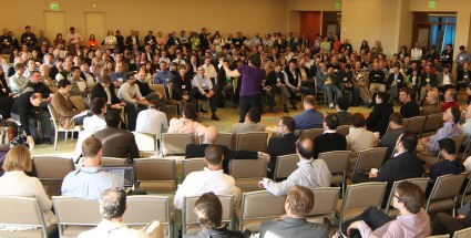
Today was the MassTLC's 3rd annual major unconference. I was one of the "experts" that attended to meet 1-on-1 with some of the budding entrepreneurs. I also heeded event main-organizer Bill Warner's request to bring "big glass" cameras and take pictures.
I have a new Canon EOS 60D DSLR. I've used digital cameras since around 1998, but this is my first DSLR (the type with removable lenses, through the lens viewing, etc.), and this is the first major event I shot photos with it. I used the "kit" lens that came with the camera (an 18-135mm image stabilized zoom) as well as a Tokina 11-16mm f2.8 very wide angle lens (which I got for some video work -- the camera also shoots HD video).
I decided to shoot lots of still pictures and just put them all up unedited on Flickr. I ended up with a little over 400. Attendees can look at them to find photos of interest if they want and even use them to make up blog posts about what it was like. They are licensed under Creative Commons with Attribution. I made the original resolution available to give people the most flexibility (most photos are at a 4.5 megapixel resolution to keep the upload time reasonable at the conference, some are larger when I first started and some have the wrong date -- new camera set wrong...).
You should be able to get a good feel for the event by looking through the photos. I have wide overall shots as well as lots and lots of closeups.
The photos are DanBricklin's MassTLC Innovation 2010 set on Flickr.
Here's a part of a photo of the initial meeting before we broke up into sessions:
 Monday, October 11, 2010
More about the iPad -- is it "magical"? [link]
It's been about 5 months since I've last posted on this blog -- way too long. In addition to work on SocialCalc for Socialtext, and some consulting for various clients and some speaking gigs (and some wonderful vacation time), I've mainly been working hard upgrading Note Taker HD for the iPad. Right now it's the #5 top "Productivity App" on the iPad (and has even been #13 of all "Paid iPad Apps" at one point). Woo hoo! Given that Apple makes (and heavily promotes) three of the top four productivity apps, that's pretty good. It's nice to have been a top productivity app on the Apple II as well as on the iPad over 30 years later, with a top programmer's tool (Dan Bricklin's Demo Program) on the IBM PC in the middle (during the mid- to late-'80s). As you get older (I'm 59) it's great to feel you can still practice the craft you love well.
[Bob Frankston coded most of VisiCalc, with Steve Lawrence, Peter Jennings, and me contributing small parts. I designed much of what it should do and coded the original prototype. I coded all of Demo, except for a snippet of code from David P. Reed (co-author of the "End-to-End Arguments" paper), and I coded all of Note Taker HD with some UI design and implementation help from Adina Bricklin.]
I've been meaning to write a little essay for some time now about how I would explain the "magical" aspects of the iPad. I've finally taken the time to do it and have just posted it as "Is the Apple iPad really 'magical'?"
With Microsoft just having announced Windows Phone 7, which they describe over and over again as "delightful", these positioning terms take on new meaning.
Here's a photo that goes with my essay:
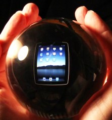 The photo is of a crystal ball in my hands, showing an iPad screen that's actually behind it. The ball was an award that Stewart Alsop gave to both Bob and me back in 1989 at the Agenda 1990 conference on the 10th anniversary of the release of VisiCalc. I remember, as we walked off the stage, Bob nonchalantly tossed his up in the air and then caught it. As it sailed up into the air, Stewart almost had a fit -- they are very fine Steuben Glass crystal that he probably paid a pretty penny for. In a later blog post maybe I'll get around to writing about some new equipment I've gotten over the last year or so, including the pieces I used to take that photo.
Friday, May 7, 2010
Dan Bricklin's Note Taker HD for the Apple iPad released [link]
After spending a week getting a feel for the iPad, and then three very hard weeks designing, programming, and testing, and then another week of waiting for Apple to do reviewing, I finally have a released notetaking application for the Apple iPad. I call it Note Taker HD to distinguish it from the original Note Taker on the iPhone and iPod touch. I started with my Note Taker code, but then reimplemented an awful lot of it (looking closely at that working old code, of course), including the main editing windows, to craft something appropriate for the iPad.
It's available now from the Apple App Store in the USA for $4.99. Just look for Note Taker HD or click here.
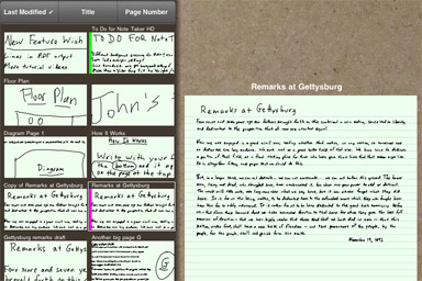 Partial screenshot of Note Taker HD's List of Pages showing the thumbnails and a page preview
Doing this product has been a very interesting experience. My early observations about the iPad still hold. The larger screen does make a big difference. Please read that essay -- the points I made there turned out to exactly describe what I learned and did in creating Note Taker HD. For example, I took advantage of the larger screen area to give more "on screen" help, by giving most buttons descriptive text labels and even showing a tooltip when you press and hold buttons. I was able to make the writing experience much better than on the iPhone by separating the writing area from the main page viewing area. I added zooming and panning to most every view of the page, and layouts crafted to the orientation that morph from one to another.
I was torn between wanting to make as great and powerful an application as possible and getting it into people's hands. I ended up concentrating on just simple handwritten notetaking, like on the iPhone app, with the same organizing metaphor of a list of pages with tags and favorites. I didn't get time to make iPad-compatible code for pages typed with the keyboard (to include them in the organized list), nor some of the page functions of the iPhone app, like manual transcribe and email as JPEG, so those features didn't make it in. (I did do email as PDF -- this time as one full note page per PDF page. The output looks great, I think.) I figured I'd see how people like the app and then determine what to do next and how much time to devote to it. I have lots of ideas of things I'd like to add.
As usual, user feedback and beta testing was very valuable.
To see a demo video of Note Taker HD, as well as screenshots and sample PDF output, go to the Note Taker HD page on Software Garden's web site.
It has been very liberating for me, a person who has built powerful tools for most of my career, to be able to work on a deep product with a rich UI. I really like designing for this type of device.
A driving design goal was to make it easy for users to learn without needing a tutorial like was required for the iPhone Note Taker. To get in the right mindset, I would go to the local Apple Store and watch people play with iPads. I kept thinking of them. How would a first-time user feel? How would I keep them from getting frustrated? How could I let them discover the full power of the two-window editing and auto-advancing at their own speed? Would it even be possible for people to have a good experience trying it alone in a store display?
As you can see in the demo video, I changed the defaults to start out with a simple one-window "draw directly on the page" design. That is what people expect and it gives them immediate, useful results without seeing confusing ink jumping around or strange buttons. I made sure that it, and other views, all zoom with the pinch gesture. After they've used the one-view editing for a while, though, they learn that they need to shrink the ink they write, but that repeatedly zooming in and out is tedious. Hopefully the "Edit 2" button will entice them into pushing it and finding what that mode of editing is like. (The one start-up help screen mentions it.) There is a big "Advance" button that moves the Detail Area to the right. They can learn that and be very productive. Hopefully they will eventually see the "Auto-" button to its left and try pushing it. The gray Auto-Advance Area lines up with the now-gray Advance button to emphasize what it does.
All of this is much more discoverable (in many minutes of playing around) than before. But, the product is useful right away without needing to discover anything not directly instructed on the screen (instructions such as "Push the Add New Page button" in an empty list of pages). We'll see if all that makes people happy. Once they appreciate why they might need it, there is still an extensive amount of built-in written help, with a link to online video.
I also hope that the tablet form factor will encourage people to take more time exploring applications than on a phone. They are more likely sitting down, paying more careful attention, instead of standing up, flitting from app to app. Phone apps look like simple sub-functions of a phone, like a simple calculator. The phone dialer and SMS systems are pretty simple, so they set the expectations low for apps. Tablet apps look like personal computer apps, entire systems in their own right, with navigation and powerful control screens. The audio and video access products, like the popular NPR and ABC Player apps, and games like Labyrinth and Real Racing HD, all are like this. For developers, though, this means that users will expect more from an app and will be disappointed if you don't deliver.
Tuesday, April 6, 2010
Early Thoughts About the iPad [link]
I've just posted a new essay looking at smartphones and giving my initial reactions to the iPad, explaining how I see it as different. It's not "just a big iPod touch" any more than a car is just a big motorcycle. Read "Early Thoughts About the iPad".
I'm spending some time to get a feel for this device and then am planning to see what I should do with my Note Taker app to make it run better on it. So, for all of you who have been asking, yes, I am looking into making a Note Taker HD, but I need to craft it for the real device in my hands. I'll only know when I'll be done with it when I actually feel my changes and see if they are sufficient. As I move along I'll probably send out some tweets on Twitter (I'm @danb). When done I'll post here.
Wednesday, March 17, 2010
Dan Bricklin's Note Taker version 2.0 released [link]
Apple just approved my latest upgrade to Note Taker, version 2.0. This is a major upgrade that I've been working on for some time now. It makes Note Taker a much more useful tool on the Apple iPhone and iPod touch.
The theme of this upgrade is "better organization", but there are improvements in other areas as well.
The Note Taker "write with your finger" input of "ink" shrunk down onto pages of about 3"x5" remains, but cursive handwriting is better supported. In version 1.0 individually printed characters worked pretty well, but dotting an "i" or crossing a "t" in cursive handwriting would often inappropriately move the dot or cross-over to the right as part of the Auto-Advance feature. Version 2.0 has logic to detect many such "OK" overwriting situations and handle them appropriately.
The most obvious change is to the list of pages. In version 1.0 it consisted of just a text list of page names in reverse chronological order, and you had to manually type in the page names yourself with the keyboard. This made organizing tedious and was not very good for quickly finding one page out of many.
In version 2.0 the list shows thumbnails of part of each page. The thumbnail is automatically generated from the page using either an automatic or a manual crop region. Up to about 9 thumbnails can be seen at a time on the scrolling list. The list can be sorted by a variety of criteria, and there is optional filtering by "favorites" and by user-assigned tags.
Here's a partial screenshot of the list of pages view:
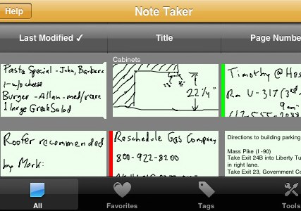 As you may see in the screenshot, in version 2.0 you can have pages that are made up of text typed in with the keyboard (or pasted from the pasteboard so you can get content from other apps). These "Typed" pages are organized as part of the same list of pages, with thumbnails of the top part. (Typed pages are only available in the full version, not the free Lite version.)
The full version also lets you render all or a subset of pages to a single multi-page PDF file (four Note Taker pages to each PDF page) and then email that file. This is a good way to archive or share what you have written.
There are many other additions. The Help system has been beefed up with a scrolling list of topics to cover much of what it has. In addition, there is now a YouTube channel where I am putting up overview and tutorial videos for those who learn better that way and don't like reading Help.
Here's a YouTube video with a 50-second overview of the app:
One of the features you may find of interest is the Favorites tab. Any page may be designated as a favorite. The tab shows a list of those favorites, sorted by last modified, title, or page number. (The page number starts out as the order created, but the user can reorder those pages like a loose-leaf notebook.) The idea is that favorites are those notes you want to always be "front and center", like the notes you stick around your desktop computer screen as opposed to those in the pile next to it or in a notebook. While last modified brings some desired pages to the top (the most recently edited) it doesn't handle reference pages well, such as a list of things to get if you happen to stop by a particular store. Favorites is a way to group those for quick access. Another way, of course, is to use a particular tag for a similar purpose, but having an explicit Favorite setting makes that use more obvious for a non-programmer.
The interesting addition is the designation of a page as a "Favorite Later". This is a date/time after which the page will automatically move from the Later list to the Favorites list. This is like a note that you put in the "get to it later" pile that automatically gets moved to the "do it now" pile after a specified amount of time has passed. The feature can be used, for example, to remind yourself to do something tomorrow, or next week, etc. Unfortunately, it does not sound an alarm or anything when a page changes state -- it just moves to the favorites list the next time you view the list of pages after its trigger time has passed. For the first 12 hours that it is in the favorites list its name is shown in yellow instead of the normal white. The Later list is displayed below the Favorites list when you push the Favorites tab.
I hope you like the new version. It's available as a free upgrade to existing Note Taker users and replaces the old one in the App Store. If after trying it you do like it, please let others know by rating it and reviewing it on the App Store.
For more information, go to Software Garden's Note Taker product page. To get it for your Apple iPhone/iPod touch, go to "Note Taker" on the App Store.
This upgrade is for the iPhone and iPod touch. After I get an iPad (I've ordered one) I can comment more knowledgeably about how my app relates to that device. I've found that a product like Note Taker requires actually having the platform it will run on in hand to craft it appropriately. This upgrade, though, adds features that should be helpful on all devices, small and large.
Passover's coming -- time for Haggadah podcast [link]
Did you ever wonder "Where did the Passover Seder come from?" or "Why are there four questions and four cups of wine?" or "What is the Talmud like?"
Passover is coming in two weeks, and I think many of my readers will find listening to a series of recordings I made a couple of years ago worthwhile preparation for the Seders they may be attending (or leading). Others who are not planning to attend a Seder, but always wondered what the Talmud was all about, may also find it enlightening. If you have any Jewish friends, please let them know about it, including Jewish educators. The official title of the set of recordings is " From the Passover Haggadah to the Mishnah and Back: An Introduction to Rabbinic Literature".
You can read a little more about the recordings in the post I made last year around this time, and on "About Reuven Cohn's Haggadah Recordings". You will find the MP3 files themselves on www.reuvencohn.com. (The first half hour or so may be a little slow, but the class picks up as it gets into the text and gets very meaty by the end, so hang in there.)
On most personal computers, you can just click on the MP3 links on the ReuvenCohn.com site to have them play on your computer speakers. Perhaps listening while preparing food for a Seder? Don't forget to print out a copy of the handout -- a wonderful PDF full of source material and referred to in the recordings.
|
||
|
© Copyright 1999-2018 by Daniel Bricklin
All Rights Reserved.
See disclaimer on home page.
|
||